Graphing Feature: Comparison Charts
Short Description: A comparison chart is a graph that places a facility’s performance for a measure in context with other facilities by plotting the facility’s rate, the QI Project® weighted mean, and the facility’s 99% expected performance range.
Long Description:
What are comparison charts?
QI Project participation provides a facility with the opportunity to compare its rates to an external reference group. The reference group might be drawn from the entire QI Project or from some smaller subset of facilities based on selection criteria chosen by the facility. The result can take the form of a table of data or a graph[1]. Graphs can provide an easy way to visualize data and the correct graph can help a facility identify patterns and relationships that might otherwise be overlooked. While tabular data provides extraordinary detail, the detail can sometimes get in the way. Additionally, tables don't always lend themselves to easy interpretation.
To facilitate graphic comparison of performance data, the QI Project uses a graphic known as a comparison chart. In keeping with its commitment to work collaboratively with the Joint Commission, the QI Project constructs comparison charts based on the Joint Commission's specifications. The charts portray the same information as those used by the Joint Commission and are an excellent adjunct to the survey process. In addition, they can serve as a regular part of the facility's ongoing performance evaluation process.
A comparison chart plots a facility's rate along with the comparison group's weighted mean rate, and an interval (or expected range) that is specific to the type of data. In a comparison chart:
1. The facility's rate is indicated by a blue dot.
2. The comparison group's weighted mean is indicated as a red triangle.
3. The expected performance range is indicated by a black "bar and whiskers."
Comparison charts can be created for a period of one or more quarters and for any measure for which the facility reported data[2].
The QI Project® uses two types of comparison charts that are tailored to the type of data collected. Usage depends on whether the data are discrete or continuous, and whether the measures are proportions or ratios[3],[4]. Because health care data may not be normally distributed and population sizes may be small, further adjustments may be made to the calculations for the interval of the expected range based on the comparison group's weighted mean rate, the facility's rate, and its population[5].
For discrete data (things that you count, such as patient falls, unscheduled returns to the OR, or restraint events), the adjustment generally produces upper and lower parts of the range interval that are usually of unequal size. When the facility rate is less than 50, the lower interval allowed by the formula for the discrete data type will be larger than the upper interval. Conversely, when the facility's rate is greater than 50, the upper interval allowed by the formula for the discrete data type will be larger than the lower interval. Should the facility's rate equal 50, the upper and lower range intervals will be of equal size.
For continuous data (things that you measure, such as elapsed time, blood pressure, or temperature), there is no adjustment and the upper and lower parts of the range interval are always equal.
Since The Joint Commission bases its comparison charts on a 99% expected performance range, the QI Project has adopted this range as its default range. This means that for comparison charts, there will be a 99% probability that the facility's observed rate will fall within the upper and lower boundaries of the expected range. If the observed rate is within the expected range, it is not a statistical outlier. If the observed value is outside the expected range, the rate is a statistical outlier.
Although analysis can be approached in many different ways, the following steps may help you to interpret your facility's comparison chart.
1.
Does my facility's rate ever fall
outside the expected performance range?
If a rate lies outside the expected performance range, the rate for that month
is a statistical outlier.
2. When a rate falls outside the expected performance range, would it be best characterized as an indicator of excellence or as an opportunity for improvement?
Let us assume that your facility's rate for inpatient mortality lies above the
expected performance range. Since mortality is an adverse (and admittedly not
always preventable) event, lying above the expected range might signal an
opportunity for improvement. On the other hand, if your facility's rate for
time to fibrinolysis lies below the expected performance range, that event
might be an indicator of excellence.
When a rate is within the
expected range but differs from the comparison group weighted mean, would it be
best characterized as an indicator of excellence or an opportunity for
improvement? More often than not, your facility rate will not be the same as
the comparison group weighted mean. Consequently, placing your facility's rate
in relation to the comparison group's weighted mean can suggest either
excellence or an opportunity for improvement. Depending on the specific
measure, the desirable position could either be above or below the comparison
group weighted mean. Looking at overall rates on the chart, how might one best
characterize the facility's rates in relation to the comparison group's
weighted mean?
The QI Project recommends taking the entire chart into consideration and
examining your facility's overall performance to provide clues about your
performance. Placing your facility's overall rates in context with the
comparison group's weighted mean can help you decide whether to celebrate a
success or strategize to improve.
Figure 1, below covers six months of data for a facility reporting on Measure A5.3b: "Cancellation of scheduled other ambulatory procedures by the patient." The chart below is based on information in Table 14.
1. October (#1) is an instance when the lower interval is longer because the facility's rate is less than 50.
2. In November (#2), the intervals are of equal size because the facility's rate is exactly 50.
3. The upper interval in December (#3) is longer since the facility's rate is greater than 50.
4. In January (#4), the facility's rate lies outside the interval of the expected range.
5.
Figure 1: A discrete data comparison chart showing the relationship between facility rate and interval length
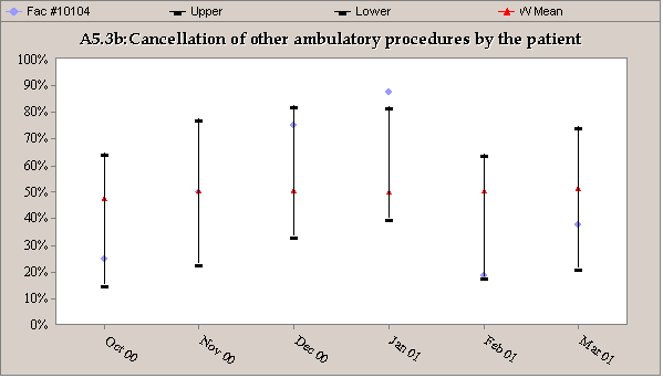
Table of Values on which Figure 1 is based.
|
|
Oct 2000 |
Nov 2000 |
Dec 2000 |
Jan 2001 |
Feb 2001 |
Mar 2001 |
|
Facility 10104's Numerator |
4 |
8 |
12 |
14 |
3 |
6 |
|
Facility 10104's Denominator |
16 |
16 |
16 |
16 |
16 |
16 |
|
Facility 10104's Rate |
25.0 |
50.0 |
75.0 |
86.0 |
18.0 |
38.0 |
|
Group's Weighted Mean |
47.0 |
50.0 |
51.0 |
50.0 |
50.0 |
52.0 |
To put these steps into practice, let's look at the figure, which is a comparison chart for the discrete data in the table. We first notice January's rate (#4) is outside the expected performance range[6]. We know that a rate outside the expected performance range is a statistical outlier and cannot be attributed to chance. Since one wouldn't normally characterize an increased number of patient cancellations as desirable, the facility would want to conduct a careful examination of the circumstances surrounding January's cancellations to determine what happened. Based on these findings, the facility would then be able to implement a plan to correct problems and thereby improve performance. For the remaining months, the facility's rate remains within the expected range but, with the exception of November, its rates differ from the comparison group's rates. There are three months in which the facility's rates are higher, two in which they are lower, and one month in which they are the same. For the six-month period, 50% of the time the facility's rate was higher, 33% of the time it was lower, and 17% of the time it was the same than that of the comparison group.
Figure 2: Comparison chart for a measure based on continuous data
#1
![]()
![]()
![]()
![]()
![]()
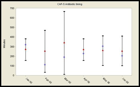
Figure 2 above is a comparison chart for the continuous data Measure PN(CAP) -5: Antibiotic Timing. Since this measure involves continuous data, the upper and lower intervals of the expected performance range are of equal size (See #1 in Figure 2). This will always be the case unless the calculation for the lower interval results in a value less than zero (0). Since the QI Project® doesn't display values less than 0, this would be the only instance in which the intervals would not be equal. During this six-month period, there are no rates outside the expected performance range. As one might expect, the facility's average time to first antibiotic differs from the comparison group. There are four months in which the time is shorter than the comparison group and two months when they are not. Indeed, 67% of the time the facility's average time to first antibiotic is shorter than the comparison group. Since a shorter time to first antibiotic is viewed as a therapeutic benefit, the facility could conjecture that its shorter times¾except for January and May¾are indicators of excellence. While this may be true, remember that the comparison chart doesn't answer every possible question. A comparison chart can't address whether the appropriate antibiotic was given, whether the times are the best that can actually be achieved by the facility, or whether the levels of performance actually demonstrated by either the facility or the comparison group are consistent with current recommendations. The answers to these and other relevant questions are also part of the analysis and interpretation process.
It is important to remember that falling within the expected performance range does not in itself imply that performance is satisfactory or that there are no opportunities to improve. While a comparison chart can't answer every question about performance, it can serve as a valuable tool to help a facility assess both its performance and its comparability to other facilities using the same definitions, rules, and patient populations.
Formulas for Calculating the Expected Performance Range for Comparison Charts
Methodology
A comparison chart is a graphical summary of the results from the “comparison analysis." It displays tabular information from the comparison analysis into a standardized graphical format so that a visually intuitive assessment may be made about a facility’s performance. A comparison chart consists of observed values, expected values (comparative norm) and confidence intervals for a given timeframe (i.e., quarterly). The 99% confidence limits (at the significant level of 0.01) are used to minimize the type II error.
To create a comparison chart, the confidence limits must be calculated using a two-step process. First, the confidence limits for the facility’s observed value are calculated based on the variation within the facility. Second, the confidence limits around the observed value are converted into “expected performance range" around the expected value or comparative norm. The formulas needed for the calculation and conversion of the confidence limits are described in the following three sections according to the type of performance measure.
The expected value or a comparative norm is the overall proportion, ratio or median of the pooled (all) patient data across facilities within a defined comparison group and a given time period. When the pooled data is not available, the sub-grouped or partial summary data can be used to “estimate" the overall expected value using the “weighted average" with the sample size as weights, either across facilities or smaller timeframes within the entire comparison group.
A statistical deviation is determined when the observed value is outside of the expected range. Depending on the direction, a statistical deviation can be categorized as desirable or undesirable. When a facility’s population for the analysis time period is very small for a performance measure, a warning message will appear to notify users that the comparison analysis may not be valid due to a small sample size and such data should be interpreted and used with caution.
Proportional Measures
The upper limit (UO) and lower limit (LO) of the confidence interval for the facility’s observed rate for a given timeframe are calculated using the following formulas.


Where ![]() , po is the facility’s
observed rate and n is the number of denominator cases.
, po is the facility’s
observed rate and n is the number of denominator cases.
The facility’s performance rate is depicted on the comparison chart by converting the confidence interval around the observed rate into an expected range around the expected rate. The upper limit (Ue) and lower limit (Le) of the expected range are calculated using the following formula.
(Ue) = pe + (po - Lo) [if Ue > 1 then Ue = 1]
(Le) = pe + (po - Uo) [if Le < 0 then Le = 0]
Where pe is the expected rate (overall rate or weighted average of sub-rates).
Small Sample Size Warning: Facilities must be particularly careful in interpretation when: (a) the number of denominator cases (n) for a proportion measure is less than 30; or (b) the number of HCOs in the comparison group is less than 10 for the non-risk adjusted measures or for the risk adjusted measures whose risk adjusted data are not available, the data may not be valid due to a small sample size and such data should be interpreted and used with caution.
Ratio Measures
The upper limit (UO) and lower limit (LO) of the confidence interval for the facility’s observed ratio for a given timeframe are calculated using the following formulas.

Where
![]() , uo
is the facility’s observed ratio and n is the denominator value.
, uo
is the facility’s observed ratio and n is the denominator value.
The facility’s performance ratio is depicted on the comparison chart by converting the confidence interval around the observed rate into an expected range around the expected rate. The upper limit (Ue) and lower limit (Le) of the expected range are calculated using the following formula.
(Ue) = ue + (uo - Lo)
(Le) = ue + (uo - Uo) [if Le < 0 then Le = 0]
Where ue is the expected ratio (overall ratio or weighted average of sub-ratios).
Small Sample Size Warning: Facilities must be particularly careful in interpretation when: (a) the number of expected numerator cases (n*ue) for a ratio measure is less than 5; or (b) the number of HCOs in the comparison group is less than 10 for the non-risk adjusted measures or for the risk adjusted measures whose risk adjusted data are not available, the data may not be valid due to a small sample size and such data should be interpreted and used with caution.
Continuous Measures
The upper limit (UO) and lower limit (LO) of the confidence interval for the facility’s observed ratio for a given timeframe are calculated using the different sets of formulas shown below, depending on the sample size.
When n ³ 30, the calculation is based on the z-statistic:
 and
and 
When n < 30, the calculation is based on the t-statistic:
 and
and 
Where
![]() , xo
is the facility’s observed median for the current quarter, S0 is the facility’s
standard deviation and n is the number of cases for the facility for the
quarter.
, xo
is the facility’s observed median for the current quarter, S0 is the facility’s
standard deviation and n is the number of cases for the facility for the
quarter.
The facility’s performance median is depicted on the comparison chart by converting the confidence interval around the observed median into an expected range around the expected median. The upper limit (Ue) and lower limit (Le) of the expected range are calculated using the following formula.
(Ue) = xe + (xo - Lo)
(Le) = xe + (xo - Uo)
Where xe is the expected median (overall median or weighted average of sub-medians).
Small Sample Size Warning: Facilities must be particularly careful in interpretation when: (a) the number of cases (n) for a continuous measure is less than 10; or (b) the number of HCOs in the comparison group is less than 10 for the non-risk adjusted measures or for the risk adjusted measures whose risk adjusted data are not available, the data may not be valid due to a small sample size and such data should be interpreted and used with caution.